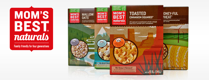
I’m LOVING the new redesigned packaging for Mom’s Best Naturals cereals. The design agency HartungKemp – now known as Ideas That Kick – brought a fresh and bold perspective to the cereal aisle.
Mom’s Best wanted to expand it’s retail footprint by appealing to co-ops and mass retail shoppers. In order to reposition Mom’s value-priced reputation, the expected photographs of cereal bowls and happy eaters were replaced with lush, colorfully illustrated landscapes. Having witnessed these on the shelf next to the other natural cereals, I can attest first-hand that the new look definitely stands out in an brilliantly unexpected way.
“Our smart new look was so popular with the client’s sales force and retail buyers that the rebranding had an immediate business impact, expanding shelf space nationwide — including, for the first time, in Target stores.” – Ideas that Kick
The re-design also included 100% recycled fiber packaging and vegetable-based inks to further compliment the brand’s quality first and environmentally conscious focus.
See more at ideasthatkick.com


